 MobileUI
5. Creating Layouts
Learn how the MobileUI layouting works.
In MobileUI, layouts are built with MobileUI's XML layout language. A layout document currently has the root element Layout within the namespace urn:nevernull:mobileui:layout.
The root element may contain different child elements as shown in the following figure.

The ViewGroupChildren XML group contains all elements that are sub classes of View. The MobileUI layout system is derived from Android's Layout System and follows the same rules. All elements in the layout are built using a hierarchy of View and ViewGroup objects. A View usually draws something the user can see and interact with. Whereas a ViewGroup is an invisible container that defines the layout structure for View and other ViewGroup objects, as shown in the following figure.

The View objects are usually called "widgets" and can be one of many subclasses, such as Button or TextView. The ViewGroup objects are usually called "layouts" can be one of many types that provide a different layout structure, such as LinearLayout or FrameLayout.
Declare your layout in XML
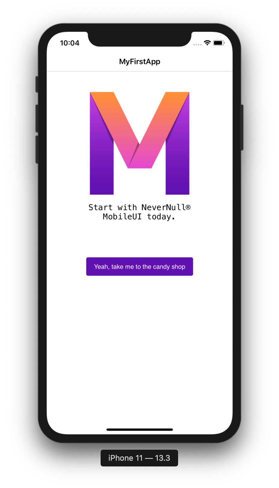
The structure of an exemplary layout document is shown in the following listing. In this case, a single LinearLayout element contains and ImageView, a TextView and a Button as children. As the LinearLayout's orientation attribute is set to vertical, these children are arranged vertically below each other. The resulting layout is shown in the screenshot below the listing.
<?xml version="1.0" encoding="UTF-8"?>
<Layout xmlns="urn:nevernull:mobileui:layout">
    <!-- @include{'app.mv'} -->
    <style>@include{'app.css'}</style>
    <LinearLayout height="fill_parent" orientation="vertical" padding="@{margin}dp"
        width="fill_parent">
        <ImageView height="160dp" marginTop="16dp"
            href="#{'https://www.nevernull.io/download/mobileui-logo-for-template/'}"
            width="fill_parent" />
        <TextView fontFamily="monospace" fontSize="18" marginTop="12dp" text="#{greeting}"
            textHorizontalAlign="center" width="fill_parent" />
        <Button backgroundColor="#6111B1" horizontalAlign="center" marginTop="56dp"
            onClick="#{onOpenUrlClicked()}" paddingLeft="12dp" paddingRight="12dp"
            text="Yeah, take me to the candy shop" textColor="white" />
    </LinearLayout>
</Layout>
Note: When developing an app, you can use MobileUI's Live Preview to modify the layout at runtime.
Style the layout with CSS
All Views and Layouts are typically styled with attributes controlling their visual appearance and behavior. Additionally, MobileUI supports the styling of all visual elements with Cascading Style Sheets (CSS). Learn more about this feature in the Styling with CSS section.
Adaptive layout system with templates
All MobileUI layouts run through a versatile Templating Engine before they are rendered to the screen. As a result, you can use variables and even control flows like if/else or foreach loops to create adaptive layouts as exemplified in the next listing.
<!-- @code{
    margin = 16;
    mainColor = 'blue';
} -->
<LinearLayout height="fill_parent" orientation="vertical" padding="@{margin}dp" width="fill_parent">
    <Button backgroundColor="@{mainColor}" text="Great!"/>
</LinearLayout>
Please refer to the MVEL for Layout Templating guide to learn more about this great possibility.
UI Data Binding
In your layout, data and actions are bound to the UI dynamically with MVEL expressions as shown below.
<TextView text="#{greeting}"/>
<Button onClick="#{onOpenUrlClicked()}" text="Yeah, take me to the candy shop" />
To bind to the above layout, you provide the greeting property and the onOpenUrlClicked() method in your bindingContext as follows:
public String greeting = "Start with NeverNull® MobileUI today.";
public void onOpenUrlClicked() {
    System.out.println(greeting);
}
For more information, please refer to the sections Applying Layouts and UI Data Binding that introduce all data binding concepts in depth.
Parts of this documentation are a derivate of the Android Developer Documentation by Google used under CC-BY-2.5.